Modal Black com bootstrap 5
Este é um exemplo de #modal Black com #bootstrap 5. estes componentes podem ser utilizados para login. informação antes de alguma ação que o usuário venha a acionar, pode também ser utilizado para formulário de contato e cadastro.
Código
<div class="container mt-3">
<div class="row">
<div class="col-12">
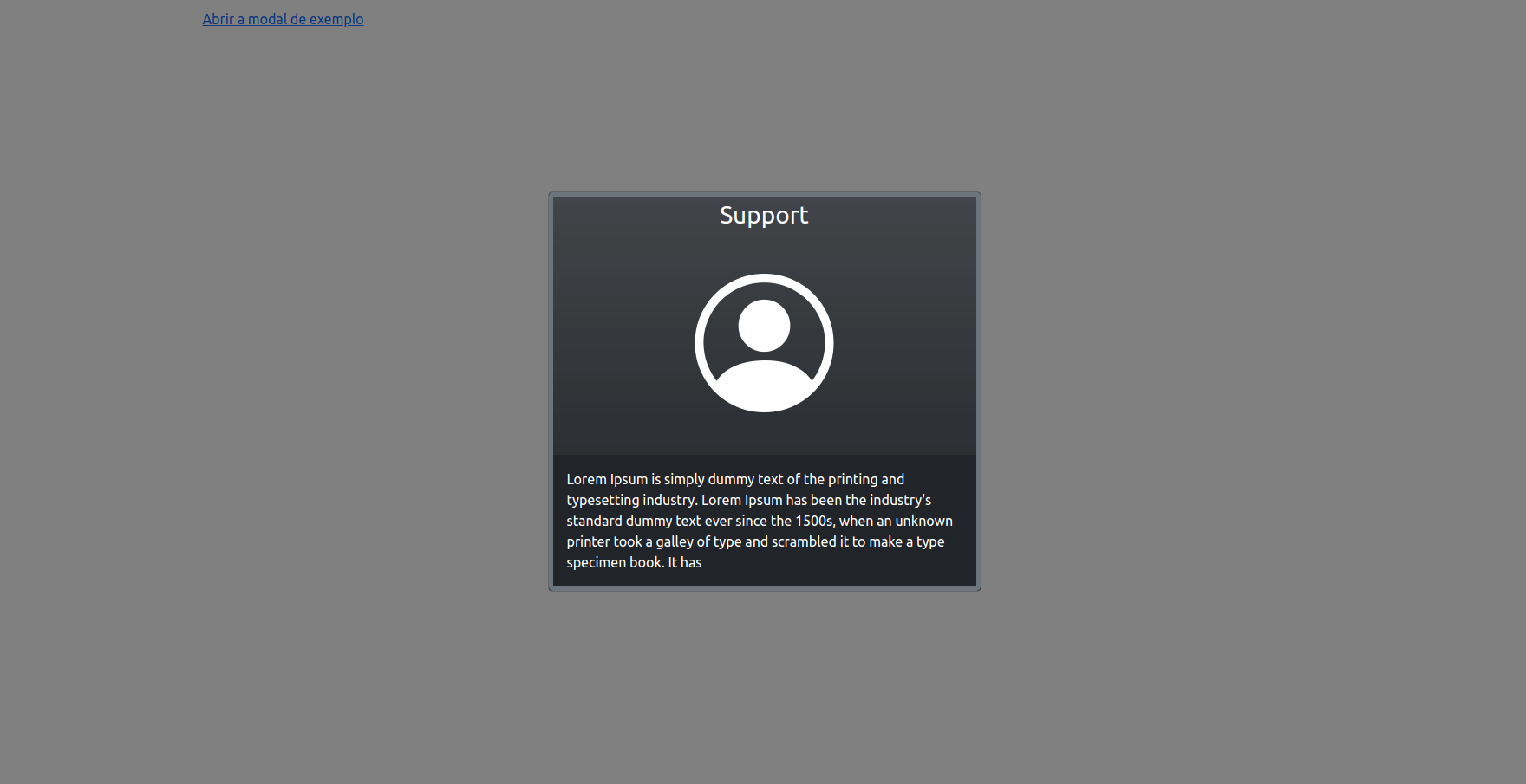
<a href="#my_modal" data-bs-toggle="modal">Abrir a modal de exemplo</a>
</div>
</div>
</div>
<!-- Modal -->
<div id="my_modal" class="modal fade" id="staticBackdrop" data-bs-backdrop="static" data-bs-keyboard="false" tabindex="-1" aria-labelledby="staticBackdropLabel" aria-hidden="true">
<div class="modal-dialog modal-dialog-centered modal-fullscreen-sm-down">
<div class="modal-content bg-dark bg-gradient opacity-90">
<div class="modal-body p-0 border border-5 border-secondary rounded-3">
<div class="row">
<div class="col-12">
<div class="text-center mb-2 text-white fs-3">
Support
</div>
<div class="text-center custom-height">
<i class="d-block bi bi-person-circle text-white mb-2 big-icon"></i>
</div>
<div class="bg-dark text-white custom-height p-3">
Lorem Ipsum is simply dummy text of the printing and typesetting industry. Lorem Ipsum has been the industry's standard dummy text ever since the 1500s, when an unknown printer took a galley of type and scrambled it to make a type
specimen book. It has
</div>
</div>
</div>
</div>
</div>
</div>
</div>
<script>
window.addEventListener("load", function(event) {
let myModalElement = document.getElementById('my_modal');
let myModal = new bootstrap.Modal(myModalElement, {
keyboard: true
});
// Se a modal for carregada junto com a página
// myModal.show();
myModalElement.addEventListener('show.bs.modal', function(event) {
console.log('modal load');
})
console.log("Todos os recursos terminaram o carregamento!");
});
</script>
Compartilhe este artigo: